
Join us in building a fintech company that provides fast and easy access to credit for small and medium sized businesses — like a bank, but without the white collars. You’ll work on software wiring million of euros, every day, to our customers.
We’re looking for both junior and experienced software developers.
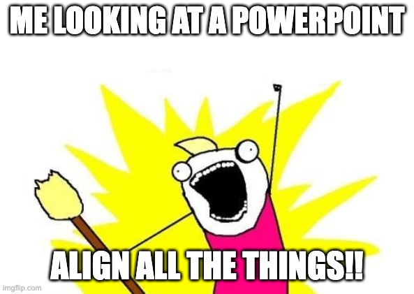
Like many people, I suffer from a “healthy OCD” to make my Data Science presentations look aesthetically pleasing. Usually your audience will appreciate this as well, because a pretty and consistent presentation helps to better convey your message to your audience. A pattern that emerged when improving presentations was doing mundane stuff like aligning all elements on all slides, applying the same formatting, the same colors on all titles and charts, adjusting font sizes, et cetera.
Usually companies have a brand book which provides guidelines and best practices on how to make your communications and presentations look pretty and consistent to help with this. E.g. use the Rockwell font in size 18 with a specific colorcode for titles. If you are lucky, your company already has as default presentation template that encodes a lot of these guidelines, e.g. default colors and fonts.
Data Scientists however tend to create charts and graphs to communicate a data story, but matplotlib, seaborn, plotly, (insert your favorite visualisation library here) obviously is not aware of your brand guidelines. As a result, graphs and charts are out-of-sync with the rest of the presentation, e.g. by using different colors and fonts.
With Plotly templates we are able to improve this! We invest a bit of time upfront in creating a custom visualization template that follows our brand guidelines. After that, we define in each Plotly chart that it should use this template. If we did a good job, all the charts will automatically follow the brand guidelines. 🎉
Although the idea sounds good, the proof is in the pudding. Therefore we will make a custom Plotly template, which conveniently follows the Floryn branding guidelines. The Plotly docs on creating themes are quite good and extensive, so be sure to read these as well. Here we will focus on constructing our Floryn template step-by-step.
Note that there are many visualization libraries for Python, matplotlib probably being the most famous. Most of the other libraries are customizable as well. In this article we have chosen for Plotly because it is our favorite visualization library due to the interactiveness it provides in notebooks.
If you are familiar with the syntactically verbose way of creating Plotly graphs with Graph Objects, you might already know that each Plotly graph consists of a Layout and a Data attribute. Note that the methods in Plotly Express, which is the recommended entry-point into the Plotly library, are all built on top of graph objects. Plotly Express is more like the syntactic sugar to improve your day-to-day life.
By using Plotly Templates we are able to define styles for both the Layout and the Data properties. Each Plotly install comes with several built-in templates:
import plotly.io as pio

pio.templates

> Templates configuration
> -----------------------
>     Default template: 'plotly'
>     Available templates:
>         ['ggplot2', 'seaborn', 'simple_white', 'plotly',
>          'plotly_white', 'plotly_dark', 'presentation', 'xgridoff',
>          'ygridoff', 'gridon', 'none']
If you do not specify a template the default template used is the plotly template. Introspection of this template is easy by printing the template:
pio.templates['plotly']

> layout.Template({
>     'data': {'bar': [{'error_x': {'color': '#2a3f5f'},
>                       'error_y': {'color': '#2a3f5f'},
>                       ...
>             },
>
>     'layout': {'annotationdefaults': {'arrowcolor': ...},
>          ...
>      }
> })
The above example is abbreviated because it would otherwise be longer than 100 lines. But note that the template here shows the layout and the data attribute, followed by some very specific settings, e.g. the color of the arrows corresponding to annotations. By changing these values we will create our own custom plotly theme.
Our team at Floryn uses a ‘dark mode’ template for presentations, so inserting a white background graph in a black background presentation is quite distracting. But if we change the background color of the graph to black, all the black gridlines will become invisible. Hence, to make this work, quite a few other colors have to updated as well. While we are at it, we also update the title font to be identical to our Powerpoint font.
The following snippet constructs our very first ‘dark mode’ Plotly theme:
import plotly.graph_objects as go

pio.templates["background"] = go.layout.Template(
    layout=dict(
        title_font=dict(family="Rockwell", size=24),
        font=dict(color="#f2f5fa"),
        paper_bgcolor="rgb(17,17,17)",
        plot_bgcolor="rgb(17,17,17)",
        title=dict(x=0.05),
        xaxis=dict(
            automargin=True,
            gridcolor="#283442",
            linecolor="#506784",
            ticks="outside",
            title={"standoff": 15},
            zerolinecolor="#283442",
            zerolinewidth=2,
        ),
        yaxis=dict(
            automargin=True,
            gridcolor="#283442",
            linecolor="#506784",
            ticks="outside",
            title={"standoff": 15},
            zerolinecolor="#283442",
            zerolinewidth=2,
        ),
    )
)
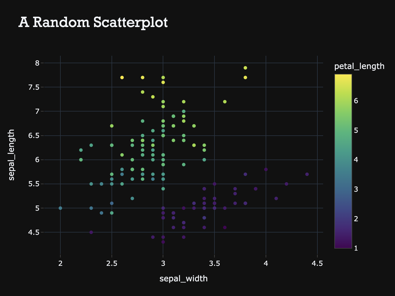
Setting the template="background" attribute in any Plotly method then enables the template, e.g.
import plotly.express as px

fig = px.scatter(
    px.data.iris(),
    x="sepal_width",
    y="sepal_length",
    color="petal_length",
    title="A Random Scatterplot",
    template="background",
)
fig.show()
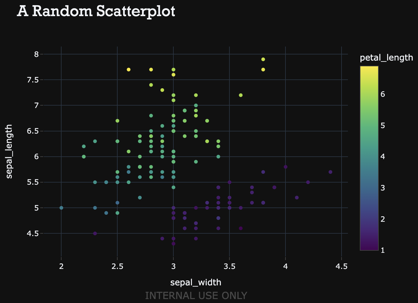
Our presentations, but especially our data, and thus plots are confidential at Floryn. Embedding this as a watermark in each plot provides an useful reminder about this confidentiality. To do this, a new template is defined, which sets the annotations attribute in the Layout component.
pio.templates["watermark"] = go.layout.Template(
    layout=dict(
        annotationdefaults=dict(font=dict(color="crimson")),
        annotations=[
            dict(
                name="internal use watermark",
                text="INTERNAL USE ONLY",
                textangle=0,
                opacity=0.50,
                font=dict(color="grey", size=16),
                xref="paper",
                yref="paper",
                x=0.5,
                y=-0.25,
                showarrow=False,
            )
        ],
    )
)

fig = px.scatter(
    px.data.iris(),
    x="sepal_width",
    y="sepal_length",
    color="petal_length",
    title="A Random Scatterplot",
    template="watermark",
)
fig.show()
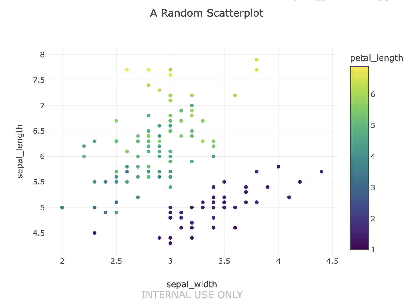
Each plot now shows an Internal Use Only watermark. 🔐
By only setting the annotations attribute in a new template, we lost all the previously defined background settings. We could have added the annotations attribute to the previously created background template, but in this case we have opted to create a new template named watermark to demonstrate that we can also use template composition.
By setting template="background+watermark" Plotly combines both templates into a single template. This can be useful if
you for some reason want a plot without the watermark, or maybe a differently styled watermark.
fig = px.scatter(
    px.data.iris(),
    x="sepal_width",
    y="sepal_length",
    color="petal_length",
    title="A Random Scatterplot",
    template="background+watermark",
)
fig.show()
The above plot combines the two templates, i.e. a dark theme with a watermark. 👭
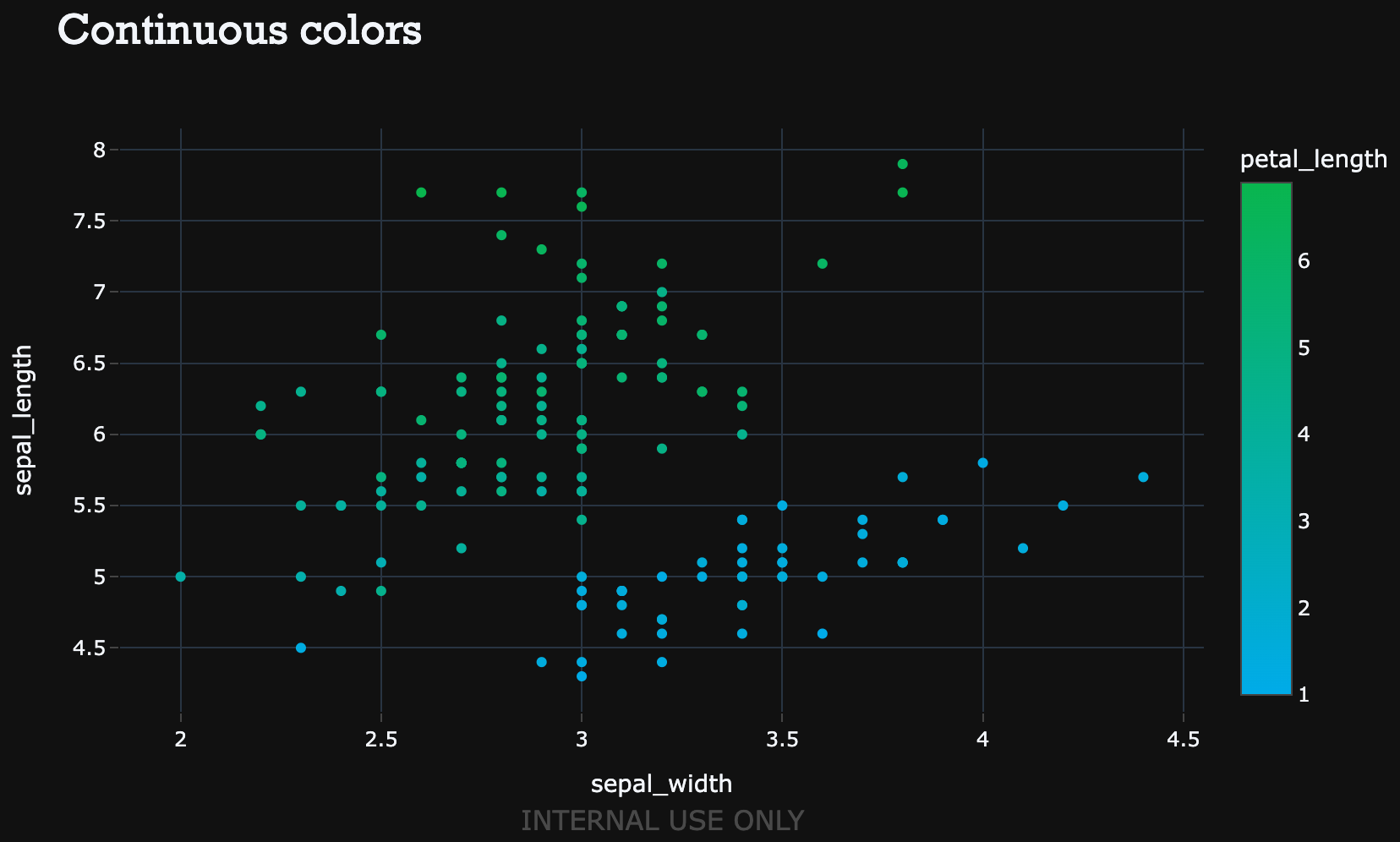
In the above plots the colors of the data points are still of. Even worse, the plots are using a gradient for the petal_length values, but it goes from purple to yellow, instead of the Floryn gradient from blue to green.
You might not be surprised that this can be defined in a template as well. However, to properly define the colors in the template, it is good to first make the distinction between discrete color scales and continuous color scales.
In the examples above, a continuous color scale was used, because the values for petal_length are continuous. A gradient for these continuous colors is set using the colorscale attribute in the layout. But within the continuous colorscales there is another a distinction to be made. From the documentation:
sequentialminus attribute as well, which is a sequential colorscale for negative values.The following template uses the Floryn brand colors for all continuous scales.
pio.templates["gradient"] = go.layout.Template(
    layout=dict(
        colorscale={
            "sequential": [
                [0.0, "#00abe9"],
                [1.0, "#09b54e"],
            ],
            "diverging": [
                [0.0, "#00abe9"],
                [1.0, "#09b54e"],
            ],
            "sequentialminus": [
                [0.0, "#00abe9"],
                [1.0, "#09b54e"],
            ],
        },
    )
)

fig = px.scatter(
    px.data.iris(),
    x="sepal_width",
    y="sepal_length",
    color="petal_length",
    title="Continuous colors",
    template="gradient+background+watermark",
)
fig.show()
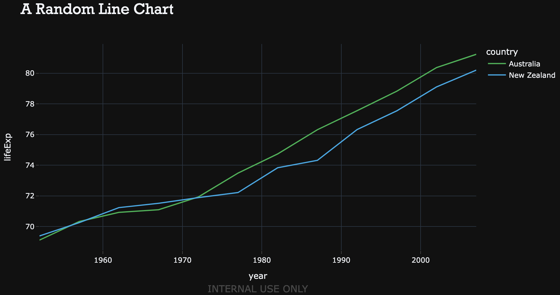
We don’t always work with continuous values, sometimes we have to be more ‘discrete’. The attribute colorway is used to specify colors for discrete data. This attribute takes a list of colorcodes: the first trace gets the first color, the second trace the second color, et cetera.
pio.templates["discrete"] = go.layout.Template(
    layout=dict(
        colorway=[
            "#09b54e",
            "#00abe9",
            "#636efa",
            "#EF553B",
            "#00cc96",
        ],
    )
)
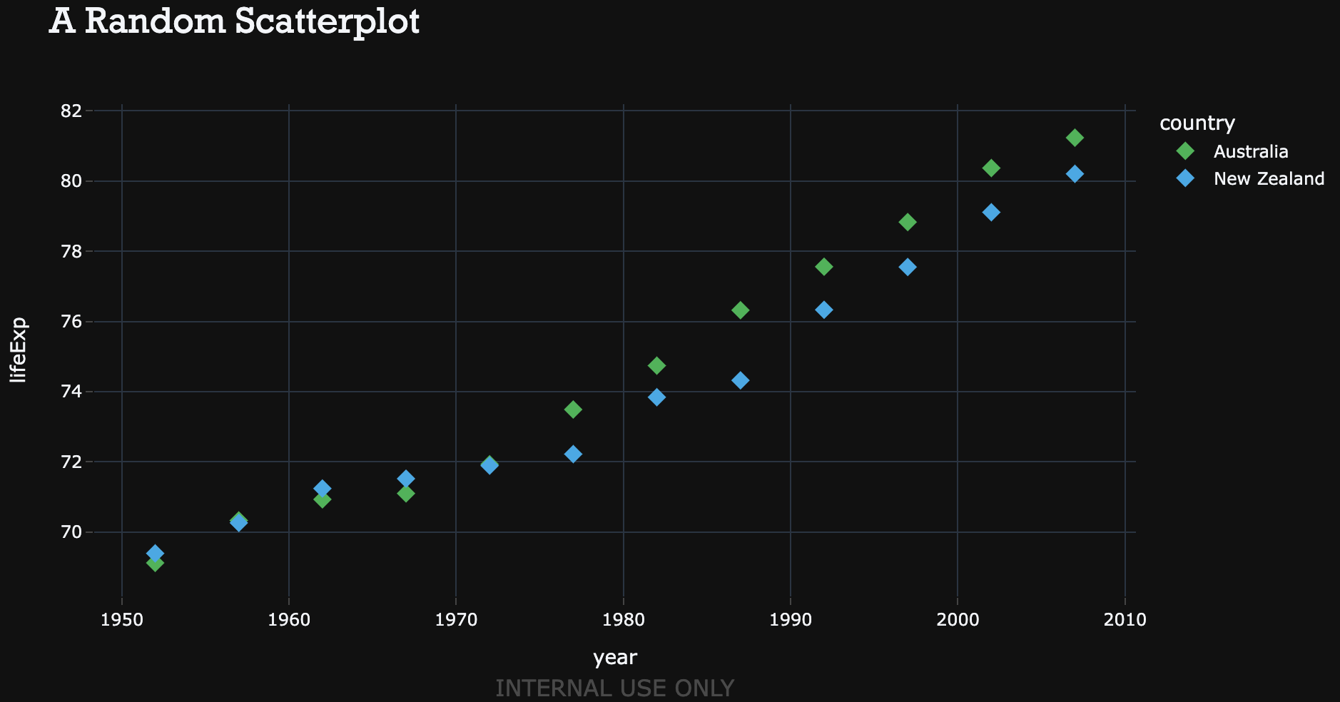
Line charts start to look like
df = px.data.gapminder().query("continent=='Oceania'")
fig = px.line(
    df,
    x="year",
    y="lifeExp",
    color="country",
    title="A Random Line Chart",
    template="discrete+background+watermark",
)
Bar charts will look like
wide_df = px.data.medals_wide()

fig = px.bar(
    wide_df,
    x="nation",
    y=["gold", "silver", "bronze"],
    title="A Random Bart Chart",
    template="discrete+background+watermark",
)
fig.show()
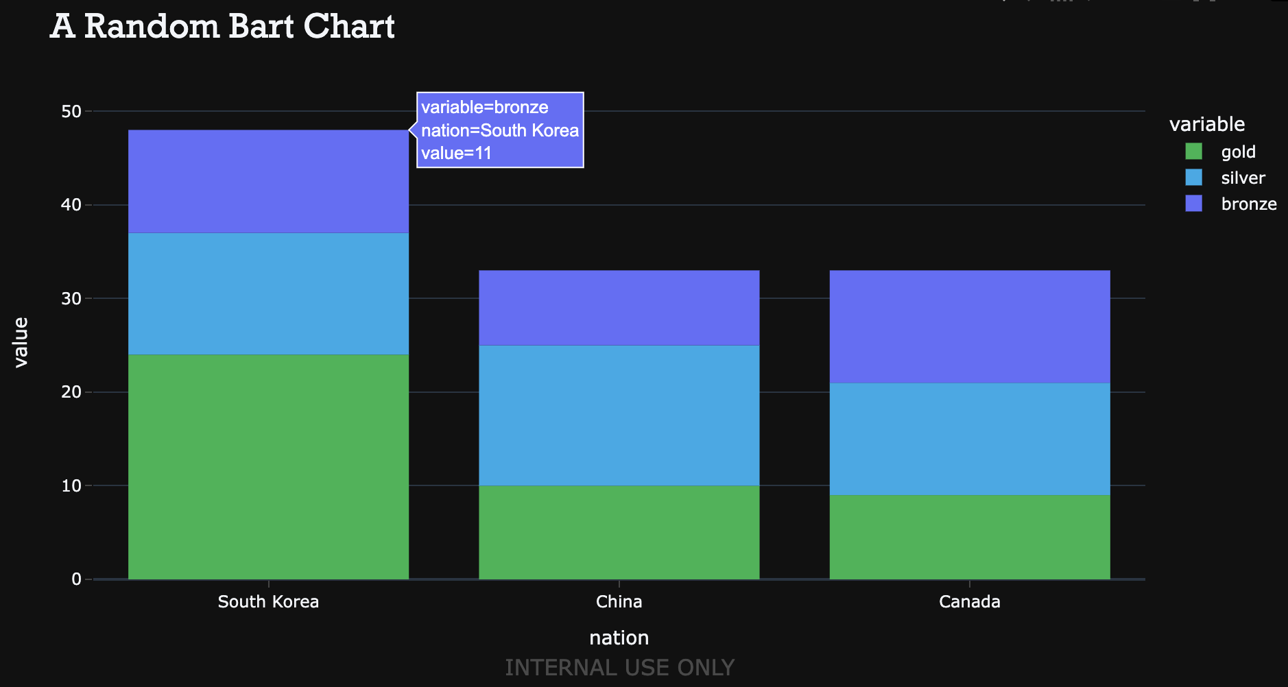
The two graphs feel very similar, even though they are two different charts. Your audience will definitely like you for this. 🤩
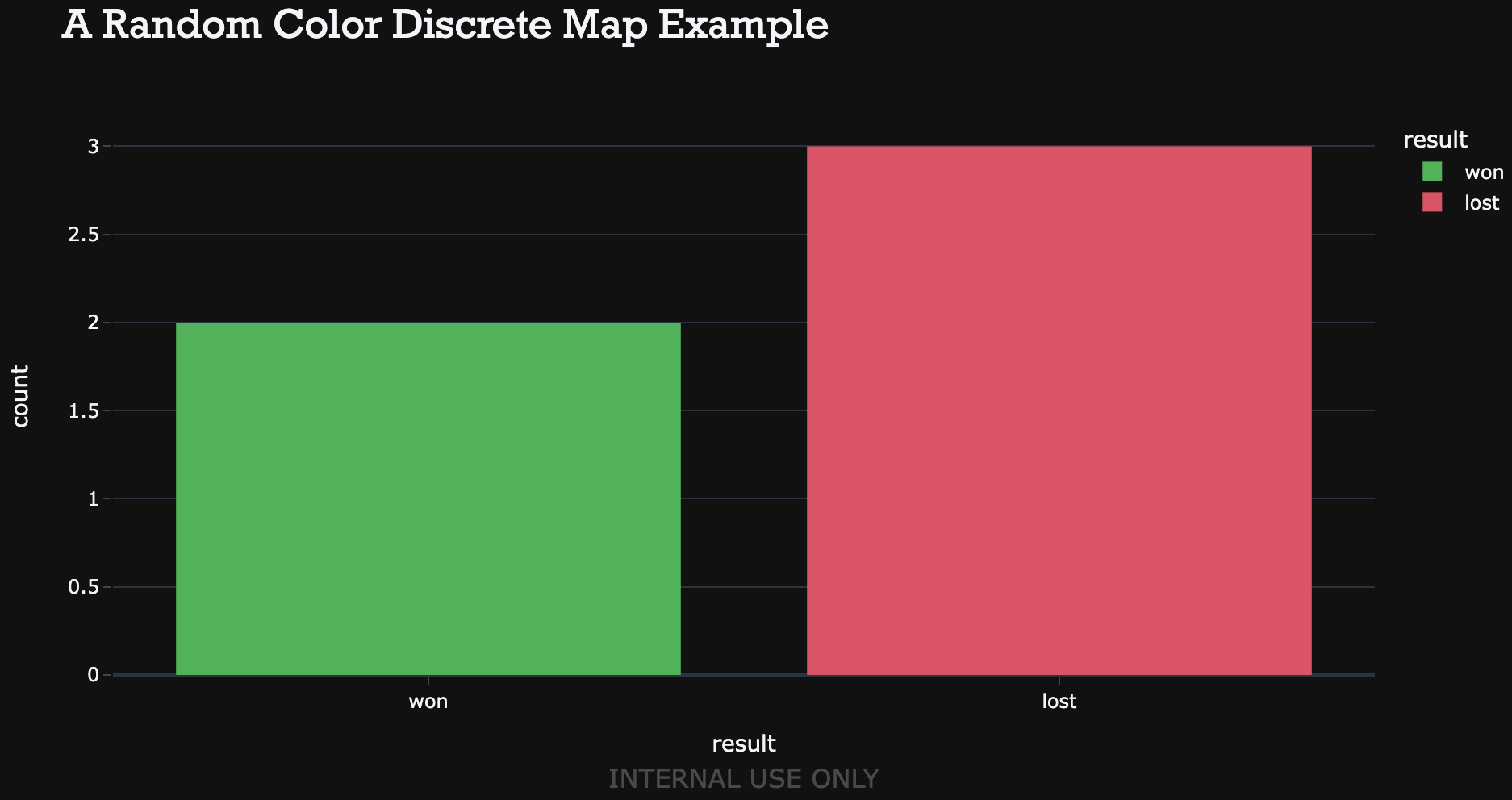
The above discrete data examples are using the Floryn colors. But sometimes, the data is better colored in a more intuitive way. For example, when plotting the gold, silver, and bronze models it could be more intuitive if the bars are colored in gold, silver and bronze.
Such data is context-sensitive making it difficult to define this in advance in a template. But it is still possible to override the template settings in the plot() method by adding the discrete_color_map attribute. For example, the following plot uses a pattern that fits better with the typical setting of a Won/Lost deal by coloring Won deals in green, and Lost deals in red.
df = pd.DataFrame([[2, "won"], [3, "lost"]], columns=["count", "result"])

fig = px.bar(
    df,
    x="result",
    y="count",
    color="result",
    color_discrete_map={"won": "#09B54E", "lost": "#EA4763"},
    title="A Random Color Discrete Map Example",
    template="discrete+background+watermark",
)
fig.show()
Only using the Layout attribute already provides the necessary customization to almost completely adhere to the Floryn brand guidelines. However, the Data attribute allows for even more customization. 🚀
The Data property of a template is used to customize the default values of the traces that are added to a figure. So, where the Layout attribute provided generic styling, the Data attribute provides even more granular customization per type. E.g. a bar chart could have a grey-colored y-axis, whereas a histogram might have a pitch black y-axis with a larger font size.
The template sets all markers in scatterplots to diamonds, but in all other types, the markers are still set to the default type.
pio.templates["scatter"] = go.layout.Template(
    data=dict(
        scatter=[
            go.Scatter(marker=dict(symbol="diamond", size=10))
        ]
    )
)
Leveraging the power of Plotly templates (or the templating tools of your favorite visualization library) enables you to create fancy graphs and appeasing charts, that adhere to your company brand guidelines. Define a template once in your codebase, import them at the top of a new analysis, and amaze everybody with your fancy visualizations. 📈
Floryn is a fast growing Dutch fintech, we provide loans to companies with the best customer experience and service, completely online. We use our own bespoke credit models built on banking data, supported by AI & Machine Learning.
